

A lot of things have changed in the world of chiropractic website design since we started Perfect Patients. Fads are certainly not exclusive to the fashion world – they appear in the Internet world as well. Rather than sway with the changing tides, we focus on several timeless principles of design to attract new patients to your practice.
Here are just three of those principles. How many does your chiropractor web design incorporate?
First chiropractor web design principle: Grab your visitor’s attention.
Internet users have very short attention spans. Research shows that most visitors leave a web page within 10-20 seconds of arriving on the site. But if you can keep their attention past this threshold, they are more likely to browse for several minutes.
What can you do to keep their attention? Make sure that your home page answers a few simple questions at first glance:
Who are you?
What do you do?
How are you different?
Prospective patients want to verify that you actually are a chiropractor in their area and they want to know what makes you stand out from the next chiropractor in the search results. And visitors today can instantly detect an outdated design, which reflects poorly on your clinical skills. So part of effectively answering the questions above includes showing visitors that you are a current chiropractor with a modern design. Review your website design every 3-5 years to see if it needs refreshing. Do that and you’re on your way to getting more new patients from your chiropractic website design.
![]()
Second design principle: Be authentic.
While visitors are browsing your home page, they are asking themselves, “Can I trust this person?” Your website lays the foundation of trust for you to build upon in the first appointment. In fact, there won’t be a first appointment if prospective patients don’t think they can trust you from your website.
One of the best ways to establish trust is by telling visitors a little bit about yourself, your practice, and what makes you different. Your chiropractic website design should show off your personality!
Below are two very different chiropractic websites. They are clearly each targeting a different type of patient. However, they both communicate their passion and personality at a quick glance through transparent visuals and text. Some factors that build trust with visitors to these sites are that a.) they know they are experts in a specific specialty b.) they know what the chiropractor looks like and c.) they know what to expect in an appointment.


Visuals have always been an important facet of chiropractic website design. However, since prospective patients are more Internet-savvy now than ever, they can spot a stock photo a mile away. More and more chiropractors are hiring professional photographers to take pictures of themselves, their families, and their practice so they can authentically communicate their message online.
The websites above are both highly customized targeting their perfect patient. The photographs allow the visitor to quickly answer the questions “Can I trust you?” and “What makes you different?”.
We encourage all of our clients to get high quality photographs taken, and we like to feature it right on their home page. Your practice personality can be quickly and authentically illustrated through photography.
![]()
Third design principle: Show visitors their next steps.
After visitors have spent a minute or two reading about you, getting an idea of what your practice looks and feels like, and learning how you are different, they need to know what to do next. It should be obvious – schedule an appointment.
One of the ways you can make sure this is clear is to eliminate distractions. Now the visitor can easily find relevant information and take one step closer to becoming a new patient.
Remember – you may have made it through the 20-second threshold at this point, but you still only have a couple of minutes for your visitors to make a decision and act on it.
Make sure your website design is free of distraction and clutter. Everything featured on your homepage serves a clear purpose and guides the visitor toward the ultimate goal.
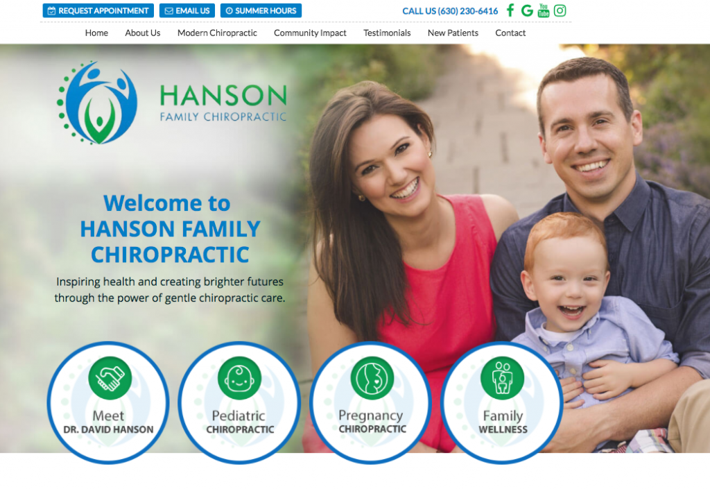
This chiropractic website design features the “Request Appointment” button, practice hours, and contact information all very prominently at the top of the page. Serious visitors don’t need to go any further to book their appointment.
The marker of a good chiropractic website design is bringing in new patients. Yes, it should be mobile-optimized, modern, and easy to navigate but at the end of the day your website needs to fill your appointment book. If visitors can’t quickly find how to book an appointment, then they will simply move on to your competitor.