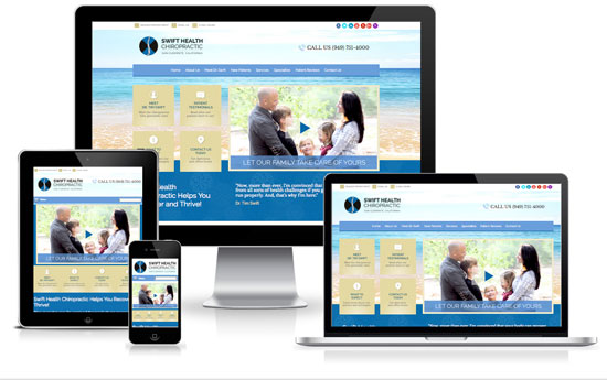
There are more than a billion websites on the Internet today. Search engines are cluttered with countless pages of search results. Competition in the online space is increasing. This has made a strategic, mistake-free website design as important as ever.
Your goal shouldn’t be to build a flashy website. Your goal should be to build a patient-generating site. That involves incorporating the right elements of design, marketing, and functionality.
Consider these five chiropractic website design mistakes to ensure that your online presence is built to produce new patients.
![]()
1. Dated Aesthetics
One of the more common website design mistakes is having a dated look. The shelf life of a website is only three to five years. Technology changes so rapidly that your website goes into decline after only a few years.
Internet users visit hundreds of different websites each year. Think they won’t notice an outdated design? An archaic design can reflect poorly on your clinical skills. After all, if you’re not up to date digitally, are you up to date clinically? Especially if you’re in a competitive jurisdiction, your website should be redesigned frequently to capture prospective patients’ attention.
2. Dull and Irrelevant Content
Every aspect of content and design should be chosen based on whether it answers the question: “Are you the chiropractor for me?” Thus, highlighting your cold laser or some other piece of equipment probably doesn’t advance your cause. What does? Pictures of you and your team, content that shares your philosophy, positive reviews from happy patients and other details presented for the purpose of getting a prospective patient to choose you.
Having cookie-cutter content that doesn’t inspire readers impacts your patient conversion rate. If your website isn’t providing useful information, prospective patients are bound to go elsewhere. You want to educate visitors about the importance of natural health, while persuading them to should choose you as their chiropractor.
3. Not Mobile-Friendly
 One of the most profound influencers in today’s online environment is whether or not your website is mobile-friendly. Less than half of searches performed on the Internet are on desktop computers. For many people, smartphones and tablets have become their primary computing device, even at home. Your site needs to be user-friendly on every device.
Mobile-friendliness is also a Google ranking factor. This means it affects how high your site will rank when someone performs a search on a mobile device.
The best way to get your site mobile-friendly is with “responsive design.” Responsive design is a technology that adjusts the way your site displays for optimal viewing on any type of device.
4. Poor Usability
Equally as important as the general aesthetic of your website is the visitor experience. The way people use the Internet today is far different from how they used it only a few years ago. For one, people have far less patience. The character limitations of social media have played a large role in that. After all, Twitter limits users to a mere 140 characters per Tweet.
Few people read online content word for word, but rather browse. (That’s what your software is called, a browser!) So content needs to be broken up into small chunks with eye-catching photos and subheadings that promise the content the visitor is looking for.
Gone are the days when people are willing to read through page after page of text. If visitors aren’t captivated the moment they land on your site, most likely they’ll be on their way to a competitor’s website.
5. No Call-to-Action
A simple “Contact Us” button linked in the menu of your website isn’t going to cut it. A call-to-action (CTA) is anything that gets your visitor to do the next thing. This action could be making a phone call, filling out a contact form, or signing up as an email subscriber.
A CTA could be a button that reads, “Click here to request an appointment!” Or it could be an attention-grabbing banner – spanning the width of your site – that encourages visitors to learn more about your practice. Think of a CTA as directions leading visitors through the “new patient journey” to their destination – booking an appointment. Without directions, your visitors are wandering a busy street with no way to turn but back.


