

Are you ready to transform your practice’s online presence in 2024?
Imagine a website that doesn’t just exist, but works as hard as you do — a digital doorway that invites new patients in and encourages them to stay.
While 98% of chiropractors have a website, as revealed in our recent State of Chiropractic Survey, the question remains: Is your website just a digital business card or a new patient magnet?
A chiropractic website that actually helps your practice grow is one that resonates with your ideal patients, addressing their needs and showcasing your unique approach to chiropractic care.
This is where Perfect Patients steps in. We don’t just build websites; we capture the essence of your practice and speak directly to the hearts of potential patients. As we venture into 2024, let us be your compass in navigating the ever-evolving world of website design. Keep reading to unlock the secrets to a website that not only looks stunning, but also delivers real results.

The Best Chiropractic Website Design Trends For 2024:
#1 Appealing Directly to Your Ideal Patients
Understanding your target audience is key. In 2024, this means branding and design that feels like a highly personalized experience for your patients. Websites tailored for specific groups – be it athletes, office workers, or families – should use design elements that immediately resonate with their unique challenges and aspirations.
Ideal Patient: Athletes
Example: Denton Sports Chiropractic’s website is a stellar example. Many sports-oriented chiropractic websites are great at signaling athleticism, but not necessarily the care that athletes will receive. Denton Sports Chiropractic does BOTH!
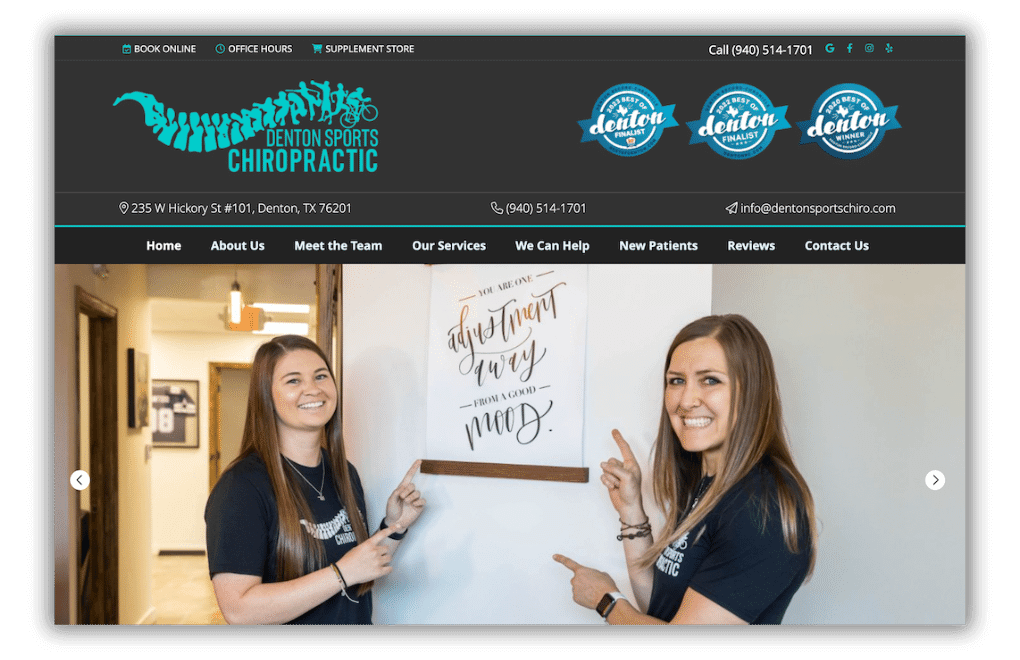
How They Do It:
- Their website features a logo that celebrates athletes of all stripes.
- Photos feature smiling team members excited to help.
- The testimonial slider celebrates many inspiring recovery stories.
- Custom content about common sports injuries.
- A blog FULL of educational articles to keep athletes in top shape.
- Bonus: they’ve won multiple “Best of Denton” awards – all featured near their logo.
This design is a home run, making athletes feel ready to leverage chiropractic care to reach their performance goals.
You can take this approach to any patient audience. Target your branding, design and content to your patient’s needs and patients will naturally choose you.
#2 Reflecting Your Practice’s Heart and Soul
Your website should be a mirror to your practice’s ethos. In 2024, this translates into immersive storytelling. Use vibrant photos of you and your staff helping the kinds of patients you’d like to see in your office with content that speaks to them.
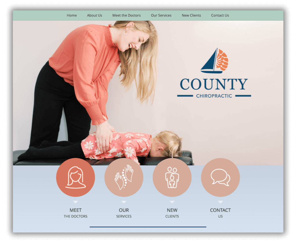
Example: County Chiropractic’s website embraces this with photos of patients from babies to grandparents, using on-trend pastel tones to subtly suggest their gentle approach to care. Prospective patients feel safer choosing chiropractic for their growing families.
Visit the site to see many more photos of patients under care, simple navigation, and easily accessible social media links.
How They Do It:
They used professional photos developed from a comprehensive shot list that shows chiropractors in their natural environments, interacting with their patients and staff.
#3 Easing Patient Anxieties
In an era where misinformation is rampant, your website must be a beacon of trust and clarity. Videos showing what it’s like to visit your office, clear menu navigation that makes it easy to find information, and empathetic content that addresses common fears are essential in 2024.
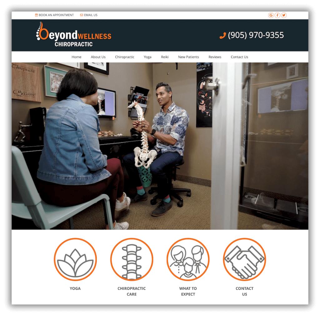
Example: Beyond Wellness uses a home page video to show exactly what it’s like to be a patient under Dr. Raphael’s care. It features a mix of his ideal patients, from mothers to babies and even grandma and grandpa. The video is quite effective! You get the full feel for the doctor’s style and an office tour to boot.
How They Do It:
They hired a professional videographer to help them script a video that feels natural to the viewer, showing the many facets of the patient experience. The subtitles in the video do the selling, while the video just shows a regular day in the office.
#4 Showing Up Authentic
In 2024, authenticity in healthcare websites is the gold standard of chiropractic branding. It’s about showing up as your true self – as a chiropractor AND as a human being with the same concerns that patients might have.
When people see the human behind the care, they become more relaxed, less nervous and more willing to commit to care. While one might think that being personal might compromise your professional authority, it actually enhances it.
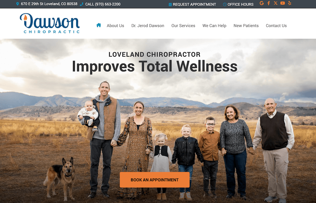
Example: How much more connected can you get than featuring your own family on your chiropractic website? Dawson Chiropractic shows their entire family against the backdrop of the gorgeous hills around their town. Mom, dad, kids and grandma and grandpa show that chiropractic wellness is for the whole family. The natural setting reminds patients that chiropractic is a natural approach to wellness.
How They Do It:
- Professional photoshoot with family.
- The setting and clothing echo their branding.
- Content expands on the ideas expressed in the branding and photos, confirming what patients are feeling… “services tailor-made just for you”, “building trust and relationships”.
2024’s Top Chiropractic Website Designs:
Now, let’s take a look at some other high-converting chiropractic websites that embody these top design trends!
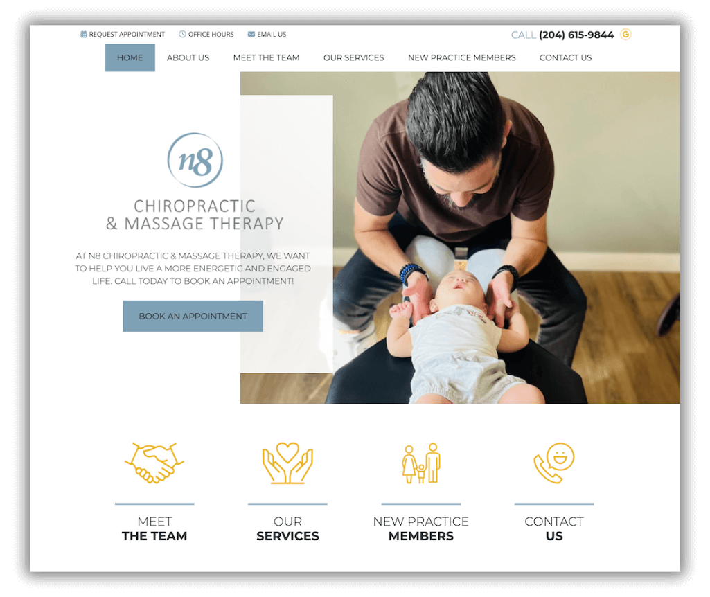
N8 Chiropractic and Massage Therapy: A minimalist design that evokes N8’s calm office environment. Relaxed photos of the three doctors reassures patients that they’re in good hands.
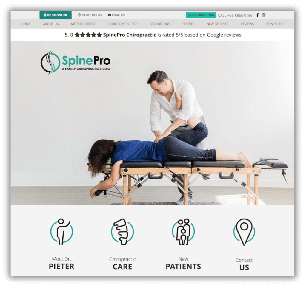
Spine Pro: This website stands out with its wide angle photos, showing just how open and airy their office is. The photos encourage you to continue scrolling down the homepage until you reach their compelling special offer.
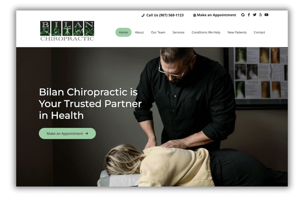
Bilan Chiropractic: Captivates with minimal design using dark tones that highlight the chiropractic adjustment. The message? It’s all about the adjustment. The patient looks at ease, the chiropractor, focused. Bilan Chiropractic IS patient care. Scroll down further and see more examples of how the practice is committed to quality chiropractic care in their local area.
Crafting Your 2024 Chiropractic Website
Remember: You don’t have to appeal to everyone. Be the right chiropractor for YOUR ideal patient and make sure your website celebrates what makes you unique in the industry.
In 2024, it’s all about creating an engaging, empathetic website that connects with your patients. What can you share on your website that leads people to chiropractic care? What is unique about your care that will resonate with your ideal patient?
Let Perfect Patients guide you in transforming your digital presence into an impactful, future-ready asset.
Schedule a no-obligation Discovery Call to chat about your current practice website, your 2024 goals, and find out how, together, we can make this your best year yet.
BOOK A DISCOVERY CALL
Want to see which Perfect Patients plan is right for you? Take our Plan Pairing Quiz to find out now!